Posts

Showing posts from October, 2020

Kyle Villano 11/4

Image
  This piece is called Pittsburgh Recollections and is by Romare Bearden. He created this image in 1984. I choose this image because I find it interesting to look at and wonder: what were Beardens intentions with this piece? Don't get me wrong, it is a great piece, I just wonder what was his inspiration for this painting? What is he trying to tell us with this painting? This is one piece that I cannot guess the answers to this question because I cannot even begin to formulate a thought to the answer. I just find myself staring at it. 

Brooklyn Bridge

Image
                The Drawing is of the Brooklyn Bridge. I choose this one because it has good use of Perspective and it is a little personal. When I head down to New York City, I go down the Brooklyn Bridge often

M Train on Route to Manhattan Approaches the Williamsburg Bridge

Image
  This painting is titled “ M Train on Route to Manhattan Approaches the Williamsburg Bridge ” it is an oil painting by Richard Estes, painted in 1995. Richard Estes mainly focuses on New York City , he is best known for his photorealistic paintings.  

Downtown Reflections

Image
  The painting I really like this work by Richard Estes. It's called "Downtown Reflection" and was made in 2001. I'm assuming it's painted. The reflection on the windshield is what pulled me in. The warped buildings are a really cool effect and its interesting to see the buildings go straight back but also from an upward view.

Holland Hotel

Image
This piece is by Richard Estes, and is called "Holland Hotel", done in 1980. I chose this piece of his because I the reflection in the window caught my eye. It's amazing how accurate and precise he makes all of his artwork.   

Emily Dee

Image
  This image is very captivating. He looks like he is pondering a question in this image. I chose this image because it looked very interesting with the lines that are used

Jake Camerino

Image
I chose this drawing because its her only one that isn't someone who looks depressed. The mother looks happy with her Child I like seeing that way more than a drawing of someone looking sad. I personally did not like the rest of her drawings I think she is a very good at drawing but nit with what she choses to draw.   

"Hunger"

Image
  This is a piece done by Kollwitz in 1924, depicting the starvation that occurred in postwar Germany. This caught my attention because of its darkness, and how she used contrast to create the two figures. It appears to be a mother and child, and both are emaciated from starvation. Kollwitz also showed the anguish in the mother's expression well by having her skeletal-like hands covering her eyes. The child's stomach is also bloated from the hunger which was shocking to see. I feel like drawing these people with skeletal characteristics is very powerful and accurately shows the severity of the starvation Germans faced after the war.

Jazmine 10/21

Image
 Richard Estes D train, 1988. I had chosen this from Estes because I myself grew up riding the train every morning to school but would never get to see this beautoful view. I would only see it when I was heading to coney isalnd so this brings back memories. I enjoyed how sharp the image looks and from its angle and persepective it makes it strikingly enjoyable to look at. 

Kathe Kollwitz- Kimberly Durso

Image
  This piece of art is called "Bread From War" by Kathe Kollwitz, created in 1924. Kollwitz's artwork symbolizes the great deal of suffering German families endured during World War I and World War II. The picture depicts two starving children begging their mother for food, specifically bread, during the time of war. I chose this picture because I thought it was interesting how Kollwitz was able to show the extreme agony though the children's facial expressions. I feel that the picture expresses such strong emotion that the viewer can almost hear the children crying. 

Kathe Kollwitz- Cj

Image
 The name of this piece of art is called Seed-Corn must not be ground. I like this photo because it looks like a father is protecting his children. The detailing on how he is able to hold all the children from within does have a deep meaning to me. The faces of all the individuals are very detailed and one can tell that the artist took their time. I like this piece because of its simplicity and how I interpreted it. overall really nice drawing by Kathe Kollwitz.

Kathe Kollwitz- Kaitlin Droluk

Image
  Kathe Kollwitz was a German artist who worked with painting, printmaking, and sculpture. She was an eloquent advocate for victims of social injustice, war, and inhumanity. Kollwitz’s first important work of art was, respectively entitled  Weavers’ Revolt.  In this picture of artwork, she portrayed the plight of the poor and oppressed with the powerfully simplified, boldly accentuated forms that became her trademark. She grieved the death of her youngest son (he died in battle) and expressed her grief through her art. I chose Misery (Not) from the  Weaver’s Revolt  collection. I love everything about this drawing. I love the emotion the mothers face gives off. Also, I really like how easy it is to follow the story behind this drawing. This drawing is a scene showing the death of her child from the deprivation of poverty. I love the shading and contrast in this drawing. 

Richard Estes

Image
  Kyle Villano 10/22/2020     This image by Richard Estes was painted in 1984 and is titled " Broadway and 64th Street, Spring ‘84". The image is of the intersection of Broadway and 64th street in New York City. I choose this image because I was immediately able to tell how this painting related to the classwork that we were doing on 10/21. I could see the two-point perspective and (just like our image) where he drew the corner like in our city corners. 

kathe kollwitz

Image
  Kollwitz's Drawing is great to look at. I chose this one because the style interest me the most. All the shapes and features are made by multiple lines. This is also the same for the shading. If you look closer, there are small pockets of white.

Germany's Starving Children

Image
    This drawing is called Germany's Children Are Starving (1924)  by Kathe Kollwitz.  It was made in 1924, commissioned by the  Workers International Relief (WIR)  against German post-war deprivation caused by inflation.  The image of the children pleadingly holding up their food bowls has a strongly appellative character. It seems that the artist was prepared to make aesthetic concessions in works with social concerns to achieve the desired effect. 

Käthe Kollwitz

Image
 The title of this piece is Mothers (Mütter). This piece was made in 1919. Kollowitz created images that depicted grief and trauma. She drew herself in the center, hugging her two sons. One of her sons, Peter, died in combat at 18 years old. I chose this piece because you can feel the love that the mother has for her children. It evokes a lot of emotion, you can see the pain on the mother's face, and how scared they are. 

banksy- dismaland

Image
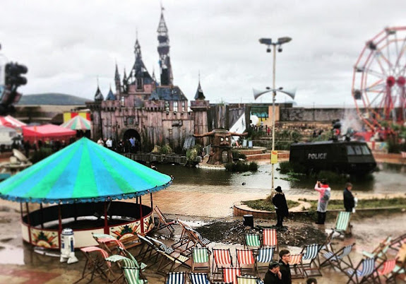
  I found this image of Banksy's dismaland to be very interesting. Banksy has a history of running away from the police due to his controversial nature, yet this picture captures a police truck in the middle of a pond. It most likely has a deeper meaning, which can be that he either finds himself "winning"/ "above" the law, or just making fun of the police force in general for everything he has gotten away with. It can show that he is having fun going against the law by the little slide that is coming out of the truck. 

Jake Camerino Dismaland

Image
  This really caught my eye because he chose to take a whale that is really big be coming out of a toilet that is small. So immediately is gonna catch peoples attention. The creativity in this is amazing only a someone with a good imagination can think if this.

Banksy's Dismaland- Kimberly Durso

Image
  This is a piece of art from Banksy's attraction, "Dismaland." The artwork depicts an Orca leaping out of a toilet, through a small hoop, and into a baby pool. I choose this piece because I like how it shows how Sea World actually is behind the scenes. The toilet bowl and the baby pool represents the dirty confined pools that the animals are held in, and the hoop depicts an irrational goal set for an animal of this size. 

Dismaland

Image
  I like what banksy did with the idea of Dismaland. The idea of Disneyland is flipped on its head with some wordplay. Instead of a fun and fantasy land, we get a sad land of drab and reality. I find this one interesting because of the little mermaid. at first I thought something was wrong at my end but I looked closer. The Little Mermaid was made to look like there was some static distortion you would see on old CRT TVs.

Jazmine 10/21

Image
  I chose this one from Käthe because I noticed her unique style when doing these. I also noticed she has a tendency of drawing faces in the background that are not fully shown and unnoticeable at first. You can also feel the energy of drowsiness and you can just feel everyone's emotions. 

Kathe Kollwitz- Kyle Villano

Image
  This is a black and white image that Kollwitz created in 1942. it is titled "Ask the Women and Children Whom Hitler is Starving Whether Rationing Is Too Great a 'Sacrifice'". This is also written on the bottom of the drawing. I choose this drawing because I felt moved by the image that she drew. Drawing kids holding empty bowls truly moved me and, if I was alive during WWII, I would be moved to do something to feed these children. I found this image @ https://www.moma.org/collection/works/5051?sov_referrer=artist&artist_id=3201&page=1

Dismaland - Cinderella

Image
    Dismaland seems like a really cool concept. Everything is so dystopian and dirty. I specifically liked the piece that shows Cinderella dead. It looks like she had a carriage accident. Her body is hanging over the entrance of the pumpkin and the horse also appears to be dead. There is a group of people taking pictures of her. I'm assuming they are like paparazzi. This is a really dark twist on the Disney style telling of this fairytale.  

Dismaland by Banksy

Image
    Dismaland was a temporary art project organized by  street artist   Banksy  in  Somerset , England.  Prepared in secret, the  pop-up exhibition    was "a sinister twist on  Disneyland " that opened during the weekend of 21 August 2015 and closed on 27 September 2015, 36 days later. Banksy described it as a "family theme park unsuitable for children.  The aesthetic of the "bemusement park" was potentially inspired by the "Dismaland" series of paintings created by American artist  Jeff Gillette , who also participated in the exhibition. I like this photo because it is a very clear message that people are putting horse meat in lasagna.  On 7 February 2013, Findus announced that in a sample of 18  beef  lasagna products that it tested, 11 contained between 60% and 100%  horse meat . It was also revealed that some of the products sold had minced  meat  declared as  beef ...

Dismaland

Image
 This image is from Banksy's work Dismal Land. I liked this one because Banksy is calling out SeaWorld for for the captivation of killer whales amongst other animals. You can see the What coming out of a small toilet, jumping through a hoop and into a kiddie pool. His works in dismal land criticizes our society that is oriented towards spectacle, entertainment, and society's carelessness towards big issues. 

Jazmine 10/14

Image
Banksy's Dismaland in England depicting a woman attacked by seagulls. I chose to do this artwork. because I found it both funny and a bit overdramatic. I loved how realistic the eagles look at a standstill and the outfit that was chosen to depict the era or timeline it's in. I also like the single eagle just watching over in the space. 

Dismaland

Image
I chose this part of Banksy's Dismaland, because it shocked me a lot more than the other pieces I found. I assumed that it could represent a butcher and the hanging carousel horse is supposed to be a butchered (or soon to be butchered) animal. I feel like the carousel is such a classic ride that is always embellished with bright colors, so it was intriguing to see this dark twist on that traditional look. This piece was also on an actual carousel that visitors could ride, so I found it really interesting that people could kind of be "part" of the artwork.

Dismaland - Banksy

Image
Dismaland was a temporary art project organized by street artist Banksy in the seaside resort of Weston-super-Mare in Somerset, England. The pop-up exhibition at the Tropicana, a disused lido, was “a sinister twist in Disneyland.” Banksy described it as a “family theme park unsuitable for children.” The show featured 58 artists of the 60 Banksy originally invited to participate. I think the killer whale jumping out of the toilet was my favorite artwork in Dismaland. I think its hysterical that he thought of this. I love everything about this unique piece of artwork. I love how real he made the whale and the trainer look. I love that he is mocking SeaWorld. I think it’s pretty cool that he was able make the whale stay in that position without falling or a pole holding the whale in place. 

Dismaland Banksy

Image
  I chose this photo because of the humor behind it. Since Banksy called it Dismaland I found it ironic that cinderella's carriage was destroyed. It is the complete opposite of what one would see in Disney World with their family. the lighting in the photo almost focuses directly on cinderella and how she is falling out of it. From the pieces that I have seen from Banksy so far this may be one of my favorites. 

Dismaland- Kyle Villano

Image
  This image is from Banksy's Dismaland. Dismaland was a temporary art display on show in England in 2015. This image is of a Police armored vehicle with a slide in a lake. I choose this image because, of all the images that were taken of Dismaland, I found this to be the most interesting. It was the first image to capture my attention and cause me to think about what Bansky was attempting to say with this piece.  Image from- https://www.thisiscolossal.com/2015/08/dismaland/

Dismal world (Banksy)

Image
  I chose this picture from Dismal World by Banksy because I liked how the picture shows what some of Banksy's art displayed here. It shows an apocalyptic Disney World and definitely a true horror to see. In the "amusement park" it shows a discolored and run-down castle along with a police van in a body of water in front of the castle. There is also a ferris wheel in the corner of the picture and a few tents as well. This picture looks like a miniature version of Disney World however with a dark twist to it.
Image
  This oil painting is titled  Un Figaro de rêve by   Jean beraud. I chooses this photo because I like how the artiest makes it look realistic with the different shades to give  it more  contrast. This painting was a part of the Europe fine art fair.

Evelyn Aguilar Sánchez

Image
This drawing is made by Evelyn Aguilar Sánchez. I choose this because the style of how she makes the images is interesting. She uses curly lines to make the images. If you zoom in onto some of the separate specs, you can see cursive words written. 

Water (Rabbit Spirit)

Image
This portrait is by Jay Golding, and it is called "Water (Rabbit Spirit)". I chose this piece because I thought the the coloring was so beautiful as well as the detail in the child's jacket. I thought that the use of blue was really interesting.   

Jazmine Pagoada 10/7

Image
https://www.artsy.net/artwork/freda-people-art-amy-whinehouse I enjoyed this piece because we were looking into graffiti in the documentary and this had caught my eye because of my interest in Amy Whinehouse. I loved that everything but her face has been edited. I also enjoy the modernization of it, I like how familiar I am with the graffiti in my own neighborhood. 

Pablo Picasso SanMiguel Oquendo

Image
This is a black and white painting by Pablo Picasso in 1955. This is a painting of Don Quixote. I chose this because I read this in high school so I had a relationship of sorts. I like the way he uses simple and sloppy drawing make it look normal from a far.

Pablo Picasso

Image
 Pablo Picasso - "The Kiss"  Pablo  Picasso  was a Spanish painter, sculptor, printmaker, ceramicist and stage designer considered one of the greatest and most influential artists of the 20th century.  Picasso Black and White  is the first exhibition to explore the remarkable use of  black and white  throughout the Spanish artist's prolific career. Claiming that color weakens, Pablo  Picasso  purged it from his work in order to highlight the formal structure and autonomy of form inherent in his art. I chose “The Kiss (Le baiser) Mas Notre-Dame-de-Vie, Mougins” by Pablo Picasso. I love the shapes in this drawing. I like the tones in this drawing. I like the used of the solid black that outlines the two people in the drawing.    

Kyle Villano- Selection from Artsy

Image
  This image is titled Sprachnachricht II is was drawn in 2018 by Hanna Hennenkemper. This image is of a microphone except the microphone was replaced by a pill. While this is probably not the true meaning of this image, I feel this image is a statement on the world's tendency to use medicine for everything, even if the medicine caused more harm than good. We all use medicine for everything, and while it helps some people to be able to live their lives, medicine can also lead to addiction, making life worse than it originally was. 

Picasso- Kimberly Durso

Image
This black and white art piece is called "The Milliner's Workshop" created by Pablo Picasso in 1926. The picture depicts the workshop on the same street as Picasso's apartment where he could see the seamstresses working through the door when passing by. I chose this piece because I thought the composition was fascinating in which he used different shapes and shades of black and white to make up the figures. I found that I had to look at the picture for a while before I could focus on the figures and understand what was being portrayed in the picture.

Black Jug and Skull

Image
 This is a black & white lithograph by Pablo Picasso. This was made in 1946 and can be associated with the suffering and death that occurred from the Second World War. Picasso was superstitious of death and the skull can depict a memorto mori, which is a reminder of death. I find this image to be somber and errie. 

"Portrait of Sylvette David 21"

Image
This is a painting done by Picasso in 1954. I chose this one because of how "normal" the girl's features looked compared to many of Picasso's other portraits. Her eyes, nose, and mouth appear to be symmetrical, unlike other portraits done by Picasso that sometimes have two different sized eyes or an abnormally large nose. I also liked how he painted her hair and showed how curly it is using curved lines. I found the contrast between these curved lines in her hair and the sharp, geometric shapes he used to draw her eyes and nose to be very interesting. The shadow on her cheek and under her chin interested me too, because they really frame the shape of her face.

Jake Camerino

Image
  I chose this black and white painting because I really like how Picasso shows the light shinning off of there skin. Certain parts of their body's and faces have lighter spots show it really shows the light shinning on them. It also caught my attention cause its not your ordinary kiss he drew it in a weird way that makes it stand out.