Posts

Showing posts from November, 2020

SanMiguel Oquendo

Image
 This drawing is called Papa by Lou Traylor. I chose this drawing because I feel as if the old man is looking through me. The way the different designs make his beard look like a very hairy without trying to draw hair is something I find cool.  

Chuck Close- Kaitlin Droluk

Image
Chuck Close is an American painter, artist and photographer. He makes massive-scale photorealist portraits. Close often paints abstract portraits of himself and others, which hang in collections internationally. Close also creates photo portraits using a very large format camera. I chose  Fanny,  1984 by Chuck Close. I love every detail, every wrinkle, every strand of hair is magnified. I don't like how she doesn't have any facial expression. Kinda, looks like a passport or drivers license photo.

Emily Gursky Chuck Close

Image
I chose this painting by Chuck Close because it was really fascinating to me. I really liked how all the shapes came together to form a full and recognizable portrait. All of the colors were cool to me too, and how the whole thing almost looks like a grid with each section separated from the other in some way. I have never seen a portrait like this before.  

Jake Camerino

Image
 I chose this one because every painting he has done mostly was in black and white so this one stood out to me the most because it has a wide range of colors in it. Also i like how its pixelated you'd think it would be hard to figure out what the painting is but you can really tell exactly what he was doing. half of his face is one color and the other is a different one i really love that.

Chuck Close- Emily Dee

Image
  This painting is titled "Big Self Portrait" by Chuck Close and is painted with acrylic on a canvas. This is a massive 9-foot high panting and is one of Chuck Close's early works. The mesmerizing details are created by scraping razor blader to depict the sharper areas of definition and rubbing with an eraser attached to an electric drill for the softer blends of tone. I chose this image because it is amazing to see the attention to detail, as I found it very interesting to see this painting while it was still in the works. It is difficult to see on this image posted, but he even painting the smoke fading into the air. 

Chuck Close- Kimberly Durso

Image
This is a painting by Chuck Close named "Cindy" and it was completed in 1988. I chose this painting because I liked how he used a drawing grid arranged in a circular pattern rather than a straight square grid. I also found that this was one of his few paintings that illustrated a person's side profile as most of Close's paintings are of front profiles.   

Shirley

Image
I picked the artwork titled "Shirley" by Chuck Close. His work with a mosaic style is interesting. I like this piece specifically because of the color palette used. I like the pink with the dark blues, it drew me in. Besides that, I like that it looks like the older woman is smiling.  

Chuck Closc- Cj

Image
  the name of this piece is called Agnes. I choose this piece because it has tiny circles within it and still makes a clear face. I found it interesting and unique that even though there are tiny circles it still makes a whole face. the eyes in this picture are something that I like as well. It's made up of the same circles on both sides. overall great piece!  

Chuck Close - Gianna Buffone

Image
This food portrait was drawn by the artist Chuck Close.  Charles Thomas Close is an American painter, artist and photographer. He makes massive-scale photorealist portraits. Close often paints abstract portraits of himself and others, which hang in collections internationally. Close also creates photo portraits using a very large format camera. This portrait is an avocado  with quadrants and it is highlighted in with bright colors. What drew me to this portrait was the colorful display and Chuck Close portraits are usually with people but this was a food and it was different.  

Chuck Close - Michael Zhang

Image
I chose this picture because this better shows what I liked. The picture is all rectangles and squares. The colors follow enough of a pattern that it makes a recognizable face. Also, the colors and the shapes make it feel like I'm looking at a person through a rough glass window.

Emma- Chuck Close

Image
 This piece is called Emma, it was done in 2002. I chose this piece because each individual square is so intricate and beautiful. The piece as a whole comes together so well. I really like how you can see the happiness and joy depicted in this piece.

Jazmine 11/18

Image
  I chose this specific one from Chuck Close because I noticed that even though they all looked the same to me, this stood out the most. The reason why is because you can almost feel the emotion of it especially the outer areas where everything seems to match in a circular motion. I tried to pinpoint what's inside of each grid but it's very trippy for me. 

Chuck Close - Kyle Villano

Image
  11/18/2020 This is a self-portrait of Chuck Close that was created in 2004-2005. This image is of a close up of his face in a grid design. I choose this image because I found it interesting to see what he did inside each grid. It appears that he drew different shapes in each grid. Additionally, it appears there not all good are the same shape. I find this fascinating that he used this style. It is like his portrait is the background had his drawings in each grid are the main picture.   

Emily Dee

Image
  This image is called "acidquiat" by Jean-Michel Basquiat. Basquiat was a pop icon, graffiti artist, musician, and neo-expressionist painter. I chose this painting because the first few face paintings all looked angry so this one stood out. However, I think the smile is contradictory because he is smiling but there are bones, and the word smile is also crossed out. Therefore, I believe this represents forced happiness. 

Kaitlin Droluk

Image
Jean- Michel Basquiat was an American artist of Haitian and Puerto descent. B asquiat first achieved fame as part of SAMO an informal graffiti  duo.  By the early 1980s, his  paintings were being exhibited in galleries and museums internationally. At 21, Basquiat became the youngest artist to ever take part in Documenta  in Kassel.  At 22, he was the youngest to exhibit at the Whitney Biennial  in New York. The Whitney Museum of American Art  held a retrospective of his art in 1992. I chose this piece of art by him because I love the detail in the background. I love the colors he chose. Lastly, I love the expression the face is making in the piece. 

Emily Gursky "Untitled (Two Heads on Gold)"

Image
  This piece was made by Jean-Michel Basquiat in 1982. I chose this painting because its color pallet was limited, unlike a lot of the other ones I found. What really caught my eye was that the two figures are not very human-like, they almost resemble robots. I also liked how details of the faces are highlighted with white paint contrasting with the other dark details of the piece. It's overall a strange but intriguing piece, and every time I look at it I seem to notice new details.

Jake Camerino

Image
  I chose this one because I love the colors he uses to capture the picture. also at first glance this doesn't really look like a great drawing but once you look closer at it and really take in the design and colors and the way he drew it really shows how amazing it is. 

Jean-Michel Basquiat - Kimberly Durso

Image
  This is an untitled painting by Jean-Michele Basquiat, created in 1982. I chose this painting because I like how he layered different colors of paint underneath the black skull. I think it is interesting how Basquiat paints in a messy style as it looks like the background of the picture was unplanned. I also noticed the scribbled letters on top of the skull that seems as if they are crossed out and covered with paint making what he wrote illegible.

The Guilt of Golden Teeth

Image
 This work from Jean-Michel Basquiat stood out to me more than his others. It's called "The Guilt of Golden Teeth" and it was made in 1982. Like his other paintings, there's a lot going on in the picture and it is very busy. Obviously, the man in the tophat is the main focus. That's what drew me in. I like his face and his little red shoes. His one arm is kind of creepy, its just hangs down.

Jean-Michel Basquiat- Cj

Image
  There is no name available for this mixed media portrait. The colors are very vibrant and bright while the face is created with different things on it. The different color eyes are something that I like along with his golden teeth. The skull looks like it's split down the middle and it has two different shades. overall this piece has its uniqueness and flavor to a mixed media that I have not seen before. 

Fishinf Cat by Jean Michel Basquait

Image
 

Skull- Riann Rooney

Image
This piece is done by Jean-Michel Basquiat, it was done in 1981 and is untitled. Heads and skulls are significant focal points in a lot of Basquiat's works. I picked this piece because I really enjoyed the emotion that it's eyes express. I also enjoy the blue, orange, and red incorporated in the piece.   

Fishing cat

Image
  This painting  is called "Fishing Cat" by  Jean-Michel Basquiat. I selected this photo because I think its really and I like how loud it is with all the colors, but you can tell that there is some type  

Head - Jean Michel Basquiat

Image
    This art drawing is called "Head" by Jean Michel Basquiat, I liked this drawing because of the interesting colors and lines to create this face. When you look at this drawing you can make out the eyes, nose, mouth, and ears. The lines that create these physical attributes are different colors to highlight these features. What I like about this drawing overall is the display of all of the lines and colorful picture.

Jazmine 11/11

Image
  This had caught my attention because I wanted to so, something similar to this piece. It also is very intriguing with the splatter of what seems to be coffee. I liked the story he is portraying as a business man with the drawn suit. 

Jazz Art - Romare Bearden

Image
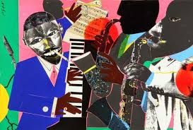
  I chose this piece called "Jazz Art" by Romare Bearden, because I liked how the people in these cut out images were playing instruments with cut outs as well. This piece was cool to look at because of the colorful images it displayed.

Kaitlin Droluk- Romare Bearden

Image
Romare Bearden was an American artist. He worked with many types of media including cartoons, oils, and collages. What gave these collages special power was their size. Originally, they were no larger than 14 by 18 inches, but striving for monumentality, Bearden has them photographed and blown up to large black and white sheets, which he named “projections”. Their size was typically six by eight feet or four by five feet. Many reviewers hailed them as ‘startling’, ‘emphatic’, ‘moving’, ‘memorable’ and ‘propagandistic in the best sense’. One of the collages that caught my eye by Romare Bearden was the collage “Mother and Child,” 1971. I love the solid background and how simple the overall piece is. I love the detail in the clothes. 

Emily Dee "Jamming at the Savoy"

Image
  Romare Bearden was an African-American artist and writer who depicted African American life. His early work focused on unity and cooperation within the African-American community. His use of the collage theme reemerged around the 1960s. I chose this piece titled "Jamming at the Savoy" because to me it is a very happy piece. The colors he used are bright and vibrant. I love music, and I enjoy how everyone looks happy playing their instruments. 

Emily Gursky "Black Venus"

Image
This is a collage titled "Black Venus" made by Romare Bearden in 1968. I really liked this collage because of how many different elements are in it. Each person is kind of silhouette-like with minimal details. Each figure is also in a different position which is interesting too. The room as a whole makes sense in terms of space too, because the figure in the foreground is the largest, and the person furthest into the background is the smallest. I also think Bearden added depth by making a "doorway" in the top right corner and two steps up to it. The different wall color in that section actually made it look like a separate room.

Jake Camerino romare bearden

Image
  I chose this because i like how he has the band with all the instruments. Every single one has there own variety of colors. Neither one really matches at all which is what makes the picture that much better.

Romare Bearden- Kimberly Durso

Image
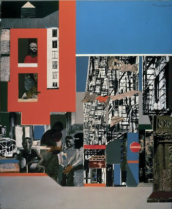
  This is an art piece by Romare Bearden called "Black Manhattan." I noticed that most of his collages are filled with vibrant colors and most depict jazz performances. This piece stood out to me because he uses a color scheme with colors that are more dull. I like how Bearden arranged the scaffolding on the building to make it seem that you are looking down the block.

Kyle Villano- Jean-Michel Basquiat

Image
  11/11/20    This piece from J ean-Michel Basquiat is titled "Untitled" and was painted in 1982. I choose this painting because I found it interesting. from reading about it I learned that this painting is supposed to represent a connection between life and death. Additionally, this painting made Jean-Michel Basquiat the most expensive at auction in 2017 for a US artist when it sild for 110.5 million. 

Romare Bearden- Cj

Image
  The title of this piece is called Guitar Magic and it was completed in 1986. I chose this piece because of the red background and the uniqueness of it. The front guitar player looks like he is pouring his emotions into playing the music and the artists in the back seem to love their instrument. The artist in the back corner is hugging his Chello where one can assume that he loves to play music. Overall this artwork can speak volumes without playing a single note.  

Romare Bearden

Image
  This painting was made by Romare Bearden, I am not really sure about the name of the painting but its titled "Jazz  Kansas City" it is part of his "the Art of Rhythm collection.   Romare Bearden loved jazz and the blues.  Music and musicians were among his favorite subjects. I like how the dark and light are all over the painting but can clearly tell what every thing once you have a good look at it.

Romare Bearden

Image
Romare Bearden's art is interesting. This is not the art I would usually like looking at, but it is unique. Vibrant colors, cutout-like features, all these make it kinda feel like a collage.  This reminds me of a certain art style that one of my favorite anime uses. In the show, The enemy and the world they create has a similar art style to this. Here is a couple of examples:

Baptism by Romare Bearden

Image
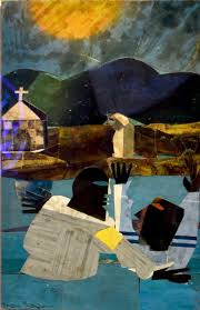
This piece is by Romare Bearden, and is called "Baptism". This piece was done in 1964. I chose this one because I found the setting the scenery in the background so beautiful. This scene makes me feel very peaceful.  

Three Folk Musicians

Image
  This piece by Romare Bearden is called "Three Folk Musicians". There are a few things about this collage that stood out to me. I really like the difference in textures and patterns on each man's face. There are also only so many different patterns used. For instance, the face of the man on the right. is the same media as the jacket and hat of the man on the left. I will say that the eyes do freak me out a little because they are from two different people and very large or small.

Jazmine 11/4

Image
  Romare Bearden, Sunday after Sermon.  I picked out this piece because it personally reminds me of home. I enjoy the aesthetics of culture just within this mixed piece itself. I also notice the various pieces he used to create things in life. Like the ladder to make it look as if it's the handles on the chair. I also enjoyed seeing how he made the background with just simply blocks of color. 

escape into life - richard estes

Image
This photorealistic painting is called "Escape into Life" by Richard Estes. What drew me to this photorealistic painting was the surreal vantage point from the side of a city bus passing by New York City. I liked how the artist used a different point of view of overlooking New York City while capturing the viewer inside the city bus. In this photorealistic painting the person who is viewing this might as well been a passenger on the bus who is touring the big city.  

Richard Estes- Kaitlin Droluk

Image
Richard Estes is an American artist, best known for his photorealist paintings. The paintings generally consist of reflective, clean, and inanimate city and geometric landscapes. I chose Columbus Avenue at 90 th  Street by Richard Estes. Most of Estes’s cityscapes fall into the four favoured perspectives that he returns to again and again- the single store, the block-front, the slant/reflection and the panorama. I love the counterpoint of the bright sunlight and deep shadows. I love how my eye was drawn into the distance, enhancing the sense of depth. I love the selection from the store windows. 

SanMiguel Oquendo

Image
   This is a oil painting by Richard Estes called  Baby Doll Lounge. This painting was created in 1978 based off of New York City. The immense amount of details in this painting is incredible. It submerges me in as if im just casually walking down the streets of the city.  

Richard Estes

Image
  American Painter Richard Estes has made a career out of fooling the eye. When I first googled Richard Estes I found it hard to believe that this image I selected titled "Diner" was painted on an oil canvas and was not a photograph. This oil painting was done in 1971 and looks too realistic to be true in my personal opinion. Estes uses photography as a starting point for his paintings. He goes out and takes dozens of photographs of the same thing from different angles, then he cuts, pastes, and manipulates the pictures. Then at his easel, he tries to make his paintings as close to the images as possible. 

SanMiguel Oquendo

Image
  The drawing above is a self Portrait by Käthe Kollwitz in  1921. This drawing caught my eye by the expression on the face. She seems lost in her thoughts and is upset. The way she uses the charcoal to create the cuts in her facial structure and the defining on the eyelids and nose, makes this a great realistic portrait. 

Jake Camerino

Image
  I chose this because I really enjoy how he drew the inside of the bus but then from the window of the bus he carried it to the street of New York city. The way he brought both things together to make it just one is amazing. Really shows how good he is.

Richard Estes- Kimberly Durso

Image
This is a painting of the Williamsburg Bridge made by Richard Estes in 1995. This painting caught my attention because it looks so realistic. It does not look like it was painted at all but it looks like a picture shot off of a professional camera. There is so much detail, Estes even included the graffiti and rust. It amazes me that he was able to paint from this angle and include all of the shadows, especially that the painting is not based on a photograph because the shadows must have been moving as he was painting. 

Richard Estes "Ansonia"

Image
This was painted by Richard Estes in 1977. I chose this painting because I don't think it is the typical perspective of a city street. It seems like the focus of it is the building's window to the right, that is showing a reflection of the street. The reflection is basically a mirror image of the buildings and street, which is really cool to see. There are also a couple plants inside the building that Estes painted as well, which adds to the depth of the piece. It seems like Estes really paid attention to each and every detail.

Man - Kathe Kollwitz

Image
    I chose this piece of art because I was drawn to how the artist made the man in the picture to be deep in thought. I also like how the artist used charcoal to draw this drawing. The man in the drawing gives the viewer an empathetic emotion towards it based on the physical characteristics on his face. This was definitely during the first world war and you can the devastation in this man's face. Kathe Kollwitz truly brought out the sadness and desperateness in this drawing. 

Richard Estes- Cj

Image
  The name of this piece is called the Holland Hotel. This medium size piece looks real and the details that Richard focused on is something I like. The way the reflection of the buildings is on the glass and the coloring he focused on is unique as well. The piece looks real enough to be portrayed as a photograph. From the sidewalks to the buildings, to the street decor one can tell this piece took quite some time for Richard Estes to make.